The average social media user scrolls through approximately 300 feet of content daily — roughly the length of a football field — spending less than two seconds evaluating whether an image deserves their attention. For photographers, marketers, and brands competing in this environment, that two-second window has become the single most expensive piece of real estate in visual media. Creating imagery that survives the scroll isn’t about luck or algorithm favors; it’s a craft built on composition principles, color psychology, and platform-specific technical choices that most creators still get wrong.
The Physics of Attention on a Feed
Instagram’s own research has indicated that posts with high color contrast see engagement rates climb by as much as 30% compared to muted, low-contrast alternatives. This isn’t a coincidence. Human vision is wired to detect contrast and motion first, meaning your image needs to win a battle against the visual noise of everything above and below it in the feed before a viewer ever processes the subject matter.
Consider the difference between a straightforward product shot on a white background versus the same product photographed against a deeply saturated complementary color. Stock imagery platforms have reported that saturated, high-contrast product photography now outperforms traditional white-background catalog shots by more than 40% in click-through rate when used in paid social campaigns.
Composition Rules That Actually Move the Needle
- Negative space with intent: Leaving 20-30% of the frame empty gives platforms room to overlay text without obscuring the subject, and it gives the eye a place to rest before returning to the focal point.
- Off-center subjects: Rule-of-thirds placement consistently outperforms dead-center compositions in A/B tests run by social media management firms, largely because centered subjects read as “stock” rather than editorial.
- Diagonal lines and leading lines: Images with strong diagonal energy generate longer average view times than static horizontal or vertical compositions, according to eye-tracking studies conducted by several ad-tech firms in 2023.
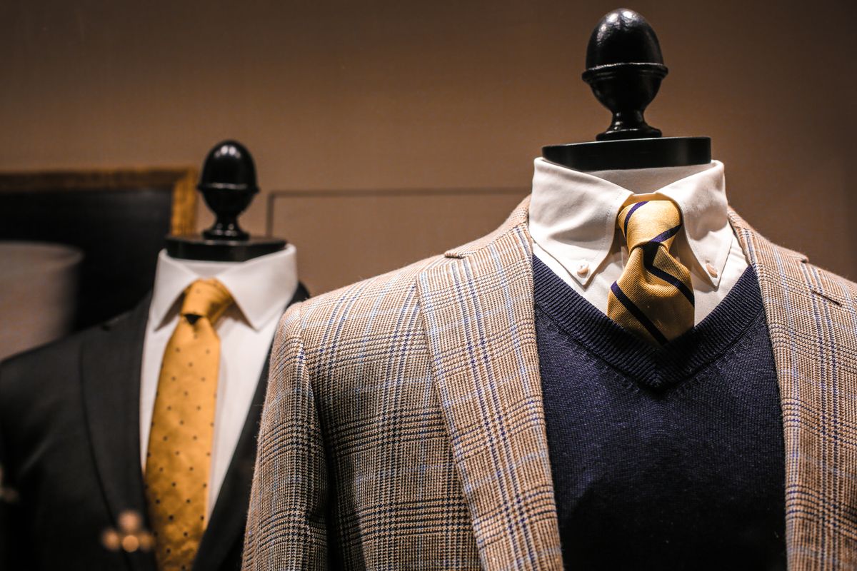
- Texture over flatness: Tactile, high-detail textures (fabric weave, water droplets, wood grain) consistently earn more saves and shares than flat, minimalist graphic compositions, particularly on Pinterest and Instagram.
Color Grading as a Retention Strategy
Color grading has quietly become one of the most underrated levers in scroll-stopping design. Warm-toned images (ambers, terracottas, warm golds) tend to outperform cool-toned blues on lifestyle and wellness content, while the opposite is often true in tech and finance verticals, where cooler palettes signal trust and precision. Brands that maintain a consistent color signature — a specific grade or LUT applied across every post — see measurably stronger brand recall, with some marketing studies suggesting recognition improves by up to 80% when color consistency is applied across a feed.
This principle extends well beyond photography into adjacent visual industries. The intersection of color psychology and material texture has been covered in depth by Clever Fashion Media, whose reporting on how apparel brands use saturated color blocking in lookbook photography offers a useful parallel for any photographer trying to make a still image feel alive on a phone screen.
Platform-Specific Technical Considerations
- Aspect ratio discipline: A 4:5 vertical crop on Instagram occupies roughly 20% more vertical feed space than a standard 1:1 square, translating directly into more scroll-time exposure per post.
- File compression awareness: Platforms aggressively compress uploads, so images with too much fine detail in shadows often lose clarity after upload. Testing your export at 80% JPEG quality before posting can prevent unpleasant surprises.
- Motion thumbnails: Even static-image carousels benefit from a first frame designed like a magazine cover, with bold typography-safe zones baked into the composition.
Practical Production Tips for Teams on a Budget
Not every brand has access to a full production studio, and that’s where smart use of digital tools closes the gap. Agencies pitching new clients, for instance, often need polished visual assets fast — and turning to a free AI business card mockup generator for client pitch decks has become a surprisingly common shortcut for photographers and marketers who need to present branded concepts professionally without commissioning a full physical mockup shoot. It’s a small example of a larger trend: AI-assisted visual tools are compressing production timelines that once took days into minutes, freeing up budget for the parts of a shoot that genuinely need a human eye, like lighting and art direction.
Cost comparisons bear this out. A traditional studio mockup session for branded collateral can run $300 to $800 depending on market and photographer rate, while AI-generated alternatives for early-stage pitch decks or social previews cost nothing beyond a few minutes of setup time. That doesn’t replace commissioned photography for final campaigns, but it dramatically lowers the barrier for testing concepts before committing to a full shoot.
Building a Repeatable System
The creators who consistently produce scroll-stopping visuals aren’t relying on inspiration alone — they’re running a system: a defined color grade, a shot list built around proven composition rules, and a testing cadence that treats every post as a small experiment. Track saves, shares, and average watch time rather than vanity likes, since these metrics correlate far more strongly with algorithmic reach in 2024 and beyond.